9 Midjourney Styles to try now: with Examples and explanations!
My current experimentation with Midjourney is basically trying new styles I haven’t used before. After some tests, I started to gather some information that could be useful, especially for beginners.
It is good to notice that I chose to apply simple prompts and show you what I got on the first try, so you can see how the styles work really and not how I worked to get an ideal result, because let’s be honest, it is not always we can get a good image at first try! In order to be honest and sincere, I decided to do that with this micro guide of styles.
The styles I will comment on are:
Calotype print,
Halftone print,
Ink drawing,
Pastel drawing,
Crayon drawing,
Comic book style,
Comic strip style,
Chromolithography.
If you like the vintage effect and the feeling of holding an old photo, then you should try the “calotype print” style. There are more effects that generate similar results, but this one is the best so far.

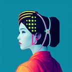
“Halftone print” is ideal for those times when you want to experiment. It is colorful and has a big visual impact.
Ink drawing, Oil paint, Pastel, and Crayon drawing are all suitable methods to get vivid and interesting drawings. Since Oil Paint is more common, I’m skipping it.
The ink drawing style is what the name says: a painted drawing (in this case, I added “colored” to create the image with color, otherwise it would be Black and White). It is not my favorite (I prefer Oil, Charcoal, and Crayon).

The pastel drawing style was disappointing for me. The results were extreme so deciding my opinion was a challenging task.
Note: Pastel sticks or crayons consist of powdered pigment combined with a binder.(Wikipedia)
See the example below: on the square, images 2 and 3 are very aesthetically pleasing and stylish. But 1 and 4 are more childish, but 4 is much better than 1.

As you can see, I got an unrequested watermark. As I noticed, it occurs frequently with the “drawings” styles. So I recommend you try to add “no word” (or something similar) on the prompt end or use negative weight, as I used for example 2: [pastel drawing illustration of a Beautiful male god]::2 words:: -1.
Again, I think the results aren’t good. I liked image 2, maybe with some adjustment, it could become an impressive piece. Depending on the context, 1 and 3 can be used too. But, I would ignore the 4th completely.
If I really wanted something in that style, I would reroll these 4 images a couple of times and see what happens.
I think “make variations” hasn’t worked well on Midjourney version 5. But, it is something you should try if you need a specific image with some issues that need to be fixed.
My advice: always select the “V” option to create variations; also, upscale the image you want, then choose “make variations”. If you didn’t get anything you wanted, you can always press both bottoms again, and keep trying. Good luck!

I must encourage you to try “Crayon Drawing”
— it is really, really good!

My results were unstable when I used the “crayon drawing” style at first. During my test, I noticed that it worked better with close-ups than with full-body shots.
So far, I really recommend you use it as I showed in the example and create this beautiful effect! I love this technique! After understanding it, you can move on and apply it to more cases and contexts.
So, give it a try, and let me know what else you discover about it!

Comic book style and Comic strip style are very similar, but the first one (as the name indicates) has a more serious, detailed, and superheroes HQ feeling.

Chromolithography. The image below is an example. I think it can be an excellent resource if you are trying to create something different and unique. For now, I just applied a “flower” and “man” prompt and it returned those images. So, try it and see if you like it!
“Chromolithography is a printing technique that involves the use of multiple colors in a single print. It is a lithographic method that uses separate stones or plates for each color, and the final image is produced by combining all the colors. The process was developed in the 1830s and became popular in the latter part of the 19th century.” (Wikipedia)
So, some of the Oracles created at that time have a similar visual, like the Blue Owl Lenormand and some Tarots.


Next time I will bring more styles and examples!